Self-Organizing Maps and Applications
Self-Organizing Feature Map (SOFM or SOM) is a simple algorithm for unsupervised learning. It can be applied to solve vide variety of problems. It quite good at learning topological structure of the data and it can be used for visualizing deep neural networks.
This article explains how SOFM works and shows different applications where it can be used.
Contents
Introduction
I was fascinated for a while with SOFM algorithm and that’s why I decided to write this article. The reason why I like it so much because it’s pretty simple and powerful approach that can be applied to solve different problems.
I believe that it’s important to understand the idea behind any algorithm even if you don’t know how to build it. For this reason, I won’t give detailed explanation on how to build your own SOFM network. Instead, I will focus on the intuition behind this algorithm and applications where you can use it. If you want to build it yourself I recommend you to read Neural Network Design book.
Intuition behind SOFM
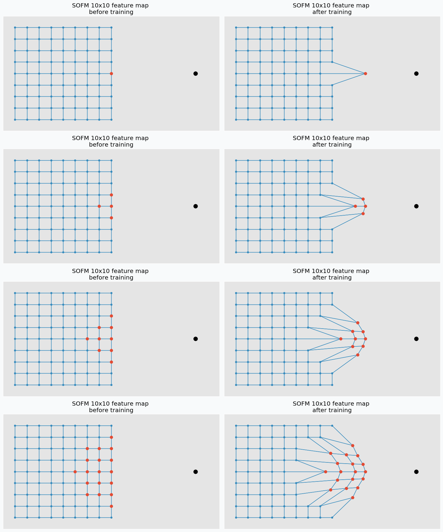
As in case of any neural network algorithms the main building blocks for SOFM are neurons. Each neuron typically connected to some other neurons, but number of this connections is small. Each neuron connected just to a few other neurons that we call close neighbors. There are many ways to arrange these connections, but the most common one is to arrange them into two-dimensional grid.

Each blue dot in the image is neuron and line between two neurons means that they are connected. We call this arrangement of neurons grid.
Each neuron in the grid has two properties: position and connections to other neurons. We define connections before we start network training and position is the only thing that changes during the training. There are many ways to initialize position for the neurons, but the easiest one is just to do it randomly. After this initialization grid won’t look as nice as it looks on the image above, but with more training iteration problem can be solved.
Let’s talk about training. In each training iteration we introduce some data point and we try to find neuron that closest to this point. Neuron that closest to this point we call neuron winner. But, instead of updating position of this neuron we find its neighbors. Note, that it’s not the same as closest neighbors. Before training we specify special parameter known as learning radius. It defines the radius within which we consider other neuron as a neighbors. On the image below you can see the same grid as before with neuron in center that we marked as a winner. You can see in the pictures that larger radius includes more neurons.
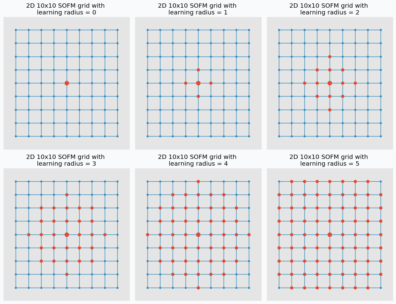
And at the end of the iteration we update our neuron winner and its neighbors positions. We change their position by pushing closer to the data point that we used to find neuron winner. We “push” winner neuron much closer to the data point compared to the neighbor neurons. In fact, the further the neighbors the less “push” it get’s towards the data point. You can see how we update neurons on the image below with different learning radius parameters.
You probably noticed that idea is very similar to k-means algorithm, but what makes it really special is the existing relations with other neurons.
It’s easy to compare this algorithm to real world. Imagine that you try to put large tablecloth on the large table. First you put it so that it will partially cover table. Then you will go around and pull different sides of the tablecloth until you cover the table. But when you pull one side, another part of the tablecloth starts moving to the direction in which you pull it, just like it happens during the training in SOFM.
Applications
Surprisingly, this simple idea has a variety of applications. In this part of the article, I’ll cover a few most common applications.
Clustering
Clustering is probably the most trivial application where you can use SOFM. In case of clustering, we treat every neuron as a centre of separate cluster. One of the problems is that during the training procedure when we pull one neuron closer to one of the cluster we will be forced to pull its neighbors as well. In order to avoid this issue, we need to break relations between neighbors, so that any update will not have influence on other neurons. If we set up this value as 0 it will mean that neuron winner doesn’t have any relations with other neurons which is exactly what we need for clustering.
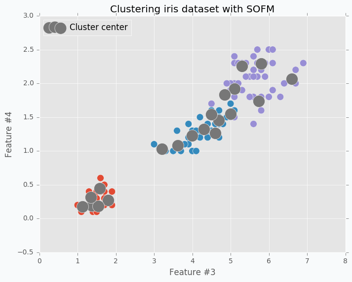
In the image below you can see visualized two features from the iris dataset and there are three SOFM neurons colored in grey. As you can see it managed to find pretty good centers of the clusters.
$ python sofm_iris_clustering.py
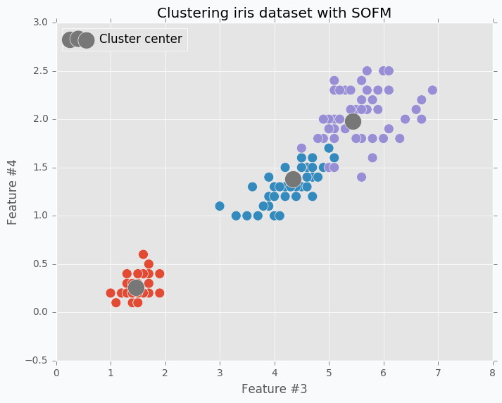
Clustering application is the useful one, but it’s not very special one. If you try to run k-mean algorithm on the same dataset that I used in this example you should be able to get roughly the same result. I don’t see any advantages for SOFM with learning radius equal to 0 against k-means. I like to think about SOFM clustering application more like a debugging. When you are trying to find where your code breaks you can disable some parts of it and try to see if the specific function breaks. With SOFM we are disabling some parts in order to see how other things will behave without it.
What would happen if we increase number of clusters? Let’s increase number of clusters from 3 to 20 and run clustering on the same data.
Neurons just spread out all over the data trying to cover it. Just in this case, since we have lots of clusters each one will cover smaller portion of the data. We can call it a micro-clustering.
Space approximation
In the previous example, we tried to do a space approximation. Space approximation is similar to clustering, but the goal is here to find the minimum number of points that cover as much data as possible. Since it’s similar to clustering we can use SOFM here as well. But as we saw in the previous example data points wasn’t using space efficiently and some points were very close to each other and some are further. Now the problem is that clusters don’t know about existence of other clusters and they behave independently. To have more cooperative behavior between clusters we can enable learning radius in SOFM. Let’s try different example. I generated two-dimensional dataset in the shape of the moon that we will try to approximate using SOFM. First, let’s try to do it without increasing learning radius and applying the same micro-clustering technique as before.
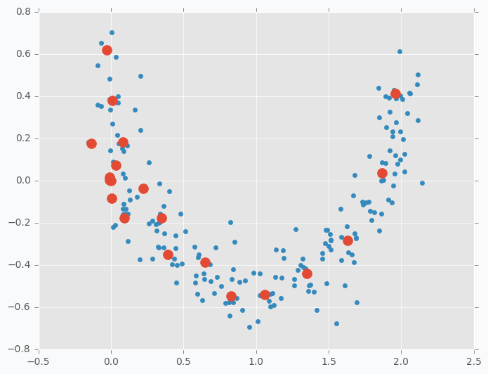
As you can see we have the same issue as we had with iris dataset. On the left side there are a few cluster centers that very close to each other and on the right side they are further apart. Now, let’s try to set up learning radius equal to 2 and let’s look what will happen.
$ python sofm_moon_topology.py
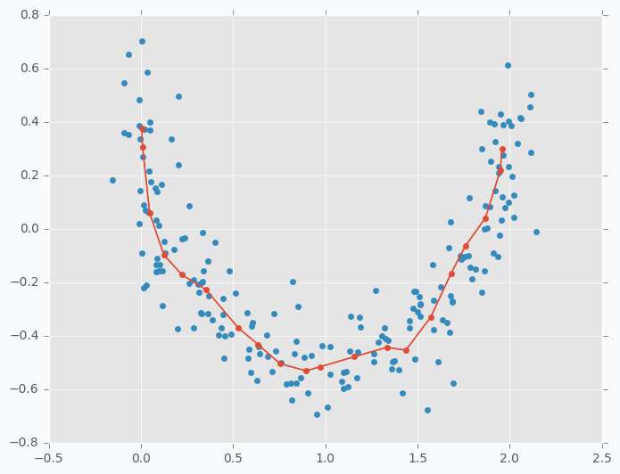
You can see that cluster centers are more efficiently distributed along the moon-shaped cluster. Even if we remove data points from the plot the center cluster will give us good understanding about the shape of our original data.
You might ask, what is the use of this application? One of the things that you can do is to use this approach in order to minimize the size of your data sample. The idea is that since feature map spreads out all over the space you can generate smaller dataset that will keep useful properties of the main one. It can be not only useful for training sample minimization, but also for other applications. For instance, in case if you have lots of unlabelled data and labelling can get expensive, you can use the same technique to find smaller sub-sample of the main dataset and label only this subset instead of the random sample.
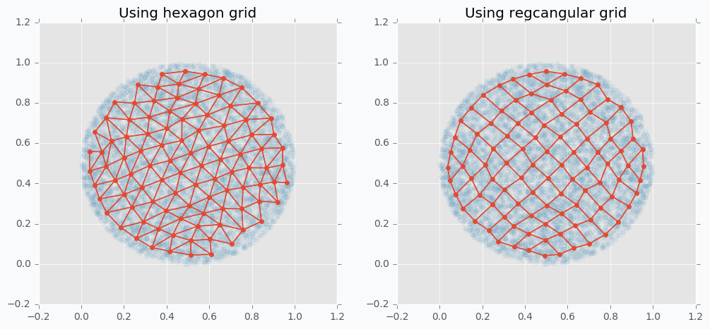
We can use more than one-dimensional grids in SOFM in order to be able to capture more complicated patterns. In the following example, you can see SOFM with two-dimensional feature map that approximates roughly 8,000 data points using only 100 features.
$ python sofm_compare_grid_types.py
The same property of space approximation can be extended to the high-dimensional datasets and used for visualizations.
High-dimensional data visualization
We used SOFM with two-dimensional feature map in order to catch dimensional properties of the datasets with only two features. If we increase number of dimensions to three it still would be possible to visualize the result, but in four dimensions it will become a bit trickier.
If we use two-dimensional grid and train SOFM over the high-dimensional data then we can encode network as a heat map where each neuron in the network will be represented by the average distance to its neighbors.
As the example, let’s take a look at the breast cancer dataset available in the scikit-learn library. This dataset has 30 features and two classes.
Let’s look what we can get if we apply described method on the 30-dimensional data.
$ python sofm_heatmap_visualization.py
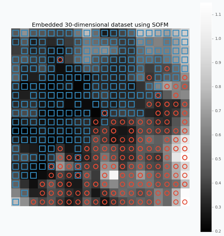
For this example, I used SOFM with 20x20 feature map. Which basically means that we have 400 micro-clusters. Most of the micro-clusters has either blue squares or red circles and just a few of them has both or none of the classes.
You can see how micro-clusters with blue squares are tended to be close to each other, and the same true for red circles. In fact, we can even draw simple bound that will separate two different classes from each other. Along this bound we can see some cases where micro-cluster has red and blue classes which means that at some places these samples sit very tight. In other cases, like in the left down corner, we can see parts that do not belong to any of the classes which means that there is a gap between data points.
You can also notice that each cell in the heat map has different color. From the colorbar, we can see that black color encodes small numbers and white color encodes large numbers. Each cell has a number associated with it that defines average distance to neighbor clusters. The white color means that cluster is far away from it’s neighbors. Group of the red circles on the right side of the plot has white color, which means that this group is far from the main cluster.
One problem is that color depends on the average distance which can be misleading in some cases. We can build a bit different visualization that will encode distance between two separate micro-clusters as a single value.
$ python sofm_heatmap_visualization.py --expanded-heatmap
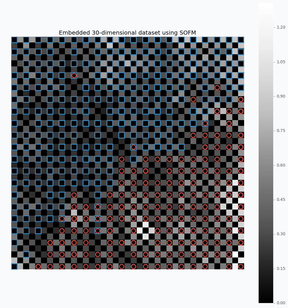
Now between every feature and its neighbor there is an extra square. As in the previous example each square encodes distance between two neighboring features. We do not consider two features in the map as neighbors in case if they connected diagonally. That’s why all diagonal squares between two micro-clusters color in black. Diagonals are a bit more difficult to encode, because in this case we have two different cases. In order to visualize it we can also take an average of these distances.
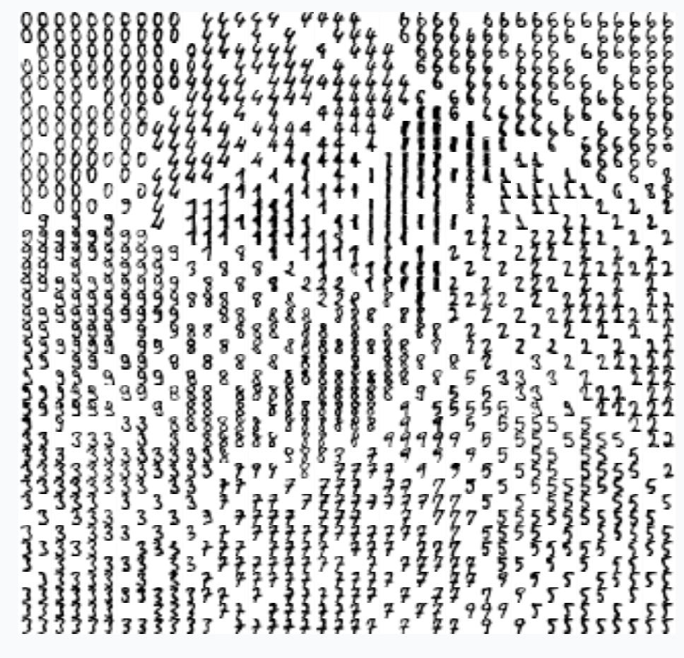
More interesting way to make this type of visualization can be with the use of images. In previous case, we use markers to encode two different classes. With images, we can use them directly as the way to represent the cluster. Let’s try to apply this idea on small dataset with images of digits from 0 to 9.
$ python sofm_digits.py
Visualize pre-trained VGG19 network
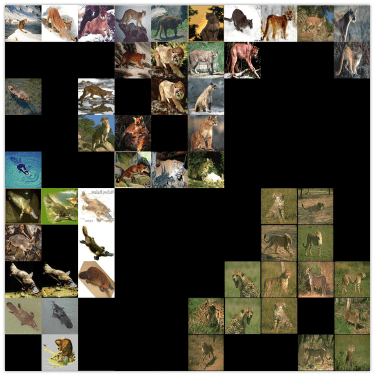
Using the same techniques, we can look inside the deep neural networks. In this section, I will be looking on the pre-trained VGG19 network using ImageNet data. Only in this case, I decided to make it a bit more challenging. Instead of using data from ImageNet I decided to pick 9 classes of different animal species from Caltech 101 dataset. The interesting part is that there are a few species that are not in the ImageNet.
The goal for this visualization is not only to see how the VGG19 network will separate different classes, but also to see if it would be able to extract some special features of the new classes that it hasn’t seen before. This information can be useful for the Transfer Learning, because from the visualization we should be able to see if network can separate unknown class from the other. If it will then it means there is no need to re-train all layers below the one which we are visualizing.
From the Caltech 101 dataset I picked the following classes:

There are a few classes that hasn’t been used in ImageNet, namely Okapi, Wild cat and Platypus.
Data was prepared in the same way as it was done for the VGG19 during training on ImageNet data. I first removed final layer from the network. Now output for each image should be 4096-dimensional vector. Because of the large dimensional size, I used cosine similarity in order to find closest SOFM neurons (instead of euclidian which we used in all previous examples).
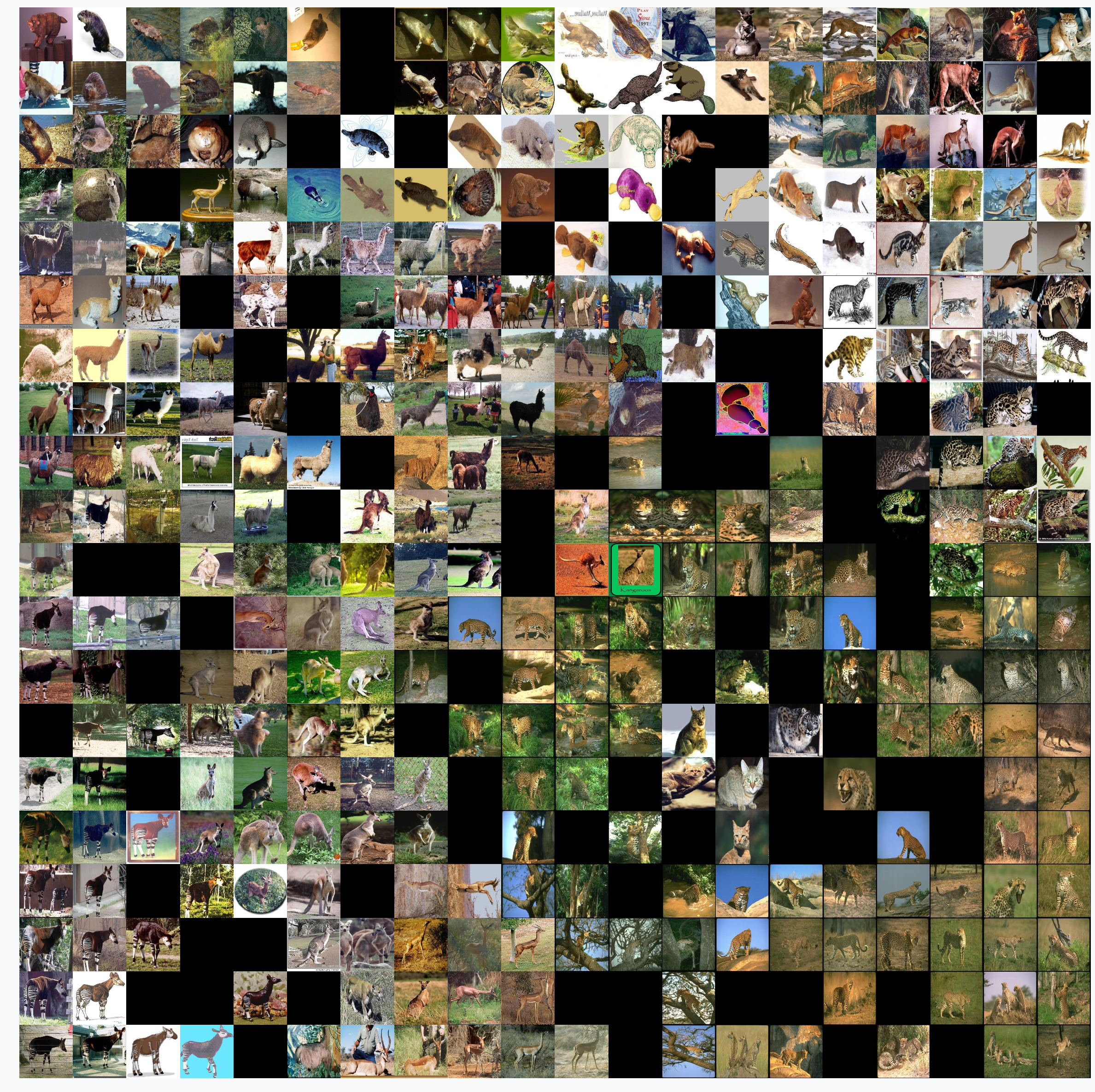
Even without getting into the details it’s easy to see that SOFM produces pretty meaningful visualization. Similar species are close to each other in the visualization which means that the main properties was captured correctly.
We can also visualize output from the last layer. From the network, we only need to remove final Softmax layer in order to get raw activation values. Using this values, we can also visualize our data.
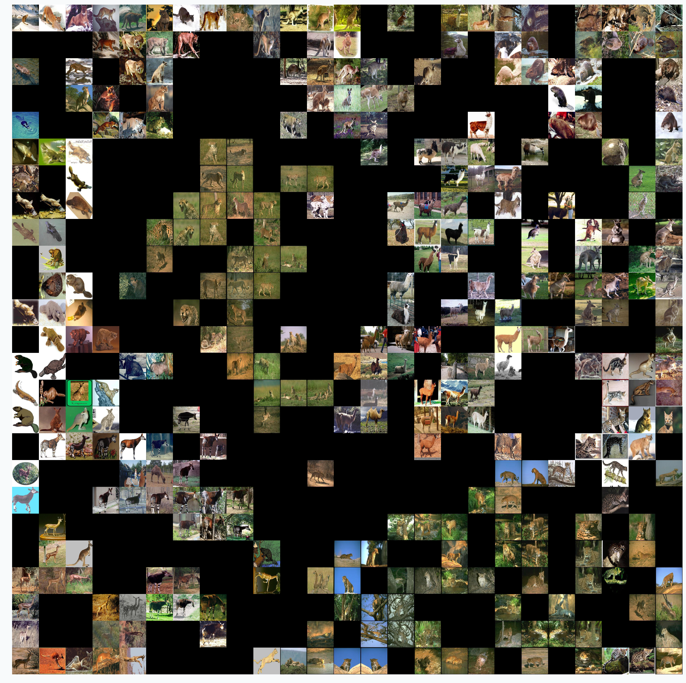
SOFM managed to identify high-dimensional structure pretty good. There are many interesting things that we can gain from this image. For instance, beaver and platypus share similar features. Since platypus wasn’t a part of the ImageNet dataset it is a reasonable mistake for the network to mix these species.
You probably noticed that there are many black squares in the image. Each square represents a gap between two micro-clusters. You can see how images of separate species are separated from other species with these gaps.
You can also see that network learned to classify rotated and scaled images very similarly which tells us that it is robust against small transformations applied to the image. In the image below, we can see a few examples.
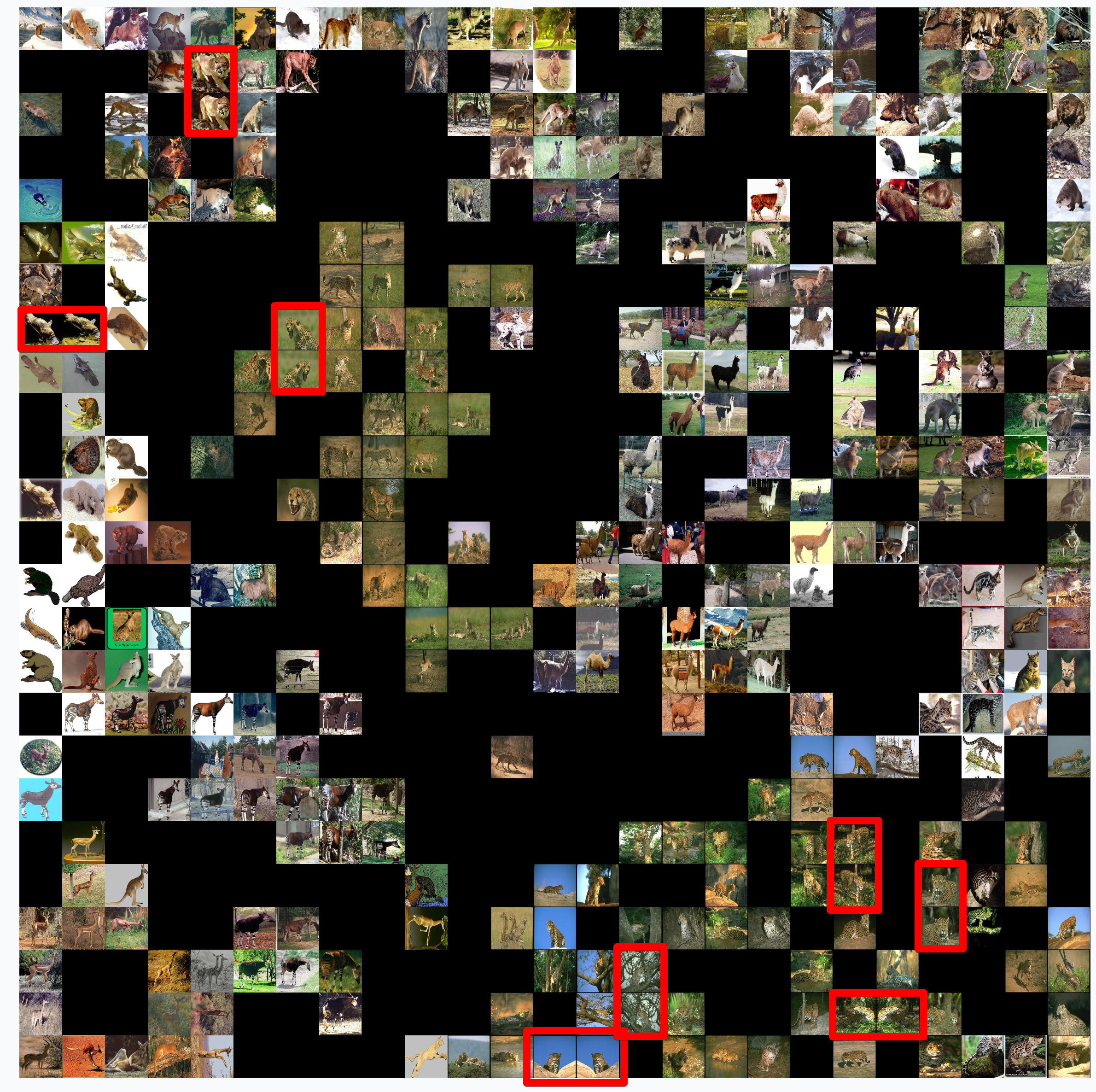
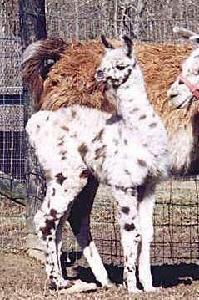
There are also some things that shows us problems with VGG19 network.. For instance, look at the image of llama that really close to the cheetah’s images.

This image looks out of place. We can check top 5 classes based on the probability that network gives to this image.
llama                                    : 31.18%
cheetah, chetah, Acinonyx jubatus        : 22.62%
tiger, Panthera tigris                   : 8.20%
lynx, catamount                          : 7.34%
snow leopard, ounce, Panthera uncia      : 5.91%
Prediction is correct, but look at the second choice. Percentage that it might be a cheetah is also pretty high. Even though cheetah and llama species are not very similar to each other, network still thinks that it can be a cheetah. The most obvious explanation of this phenomena is that llama in the image covered with spots all over the body which is a typical feature for cheetah. This example shows how easily we can fool the network.
Summary
In the article, I mentioned a few applications where SOFM can be used, but it’s not the full list. It can be also used for other applications like robotics or even for creating some beautiful pictures. It is fascinating how such a simple set of rules can be applied in order to solve very different problems.
Despite all the positive things that can be said about SOFM there are some problems that you encounter.
- There are many hyperparameters and selecting the right set of parameter can be tricky.
- SOFM doesn’t cover borders of the dataspace which means that area, volume or hypervolume of the data will be smaller than it is in real life. You can see it from the picture where we approximate circles.
It also means that if you need to pick information about outliers from your data - SOFM will probably miss it.
- Not every space approximates with SOFM. There can be some cases where SOFM fits data poorly which sometimes difficult to see.
Code
iPython notebook with code that explores VGG19 using SOFM available on github. NeuPy has Python scripts that can help you to start work with SOFM or show you how you can use SOFM for different applications.
- Simple SOFM example
- Clustering iris dataset using SOFM
- Learning half-circle topology with SOFM
- Compare feature grid types for SOFM
- Compare weight initialization methods for SOFM
- Visualize digit images in 2D space with SOFM
- Embedding 30-dimensional dataset into 2D and building heatmap visualization for SOFM